Manchester City fans got an early Christmas present when the club’s new badge appeared to be leaked by a government office.
The new crest was supposed to be revealed on Boxing Day, and the club had put posters up around Manchester, teasing fans with clues of what the design would entail. But their big reveal has now been ruined after the Intellectual Property Office published it on its website.
Three days early. Gone is the golden eagle, the stars, the motto, and the letters ‘FC’. In come a circular design, a red rose and the date 1894, when the club became Manchester City.
Fans have been quick to have their say on social media and not all of it has been positive. What has changed?

L-R: City badge from the 1930s-1972, 1972-1997, 1997-2015, 2015?
The new badge is more of a throwback to the club crest worn on shirts from 1972 to 1997, when the ship and red rose featured prominently in a circular design.
It was in 1997 that City’s current crest was introduced, when the round shape was replaced with a shield, a golden eagle and three stars, which the club say was “purely for style”.
The club consulted with fans in September over whether to change the badge and many requested a return to the round design of previous crests.
One of the biggest changes is the loss of the words ‘FC’, a move that neighbours Manchester United took in 1998, when they controversially removed the football club reference in a re-design.
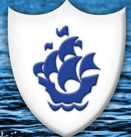
‘Like a Blue Peter badge’

Look familiar?
When the badge was leaked, fans were quick to have their say on social media
Some did not like the change…
James Wilson: The badge is an important part of a clubs history. Some things should be left untouched.
Javed Chowdry: I see the 3 stars have disappeared as nobody had a clue what they signified.
Andrew Lynn: Taking the FC or football club off it as Utd did, trying to create a “brand”.
Shane D: Its the Blue Peter badge
Some liked the return to the club’s roots…
David P Burgess: Great to see the Lancashire FA red rose in it #hotbedoffootball.
Vince Vinsect Lee: Looks like the old badge which is a good thing in my eyes, the current badge isn’t good and its launch coincided with our worst strip too.
Some took a chance to have a dig at the club…
Zinedine ZiDarren: 18…. 94….is that their average attendance figures in 2015??
Matthew Farmer: I trust it says “established 2007” on it?
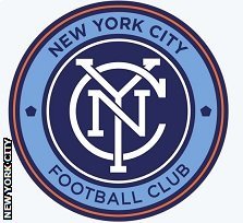
Mark McKenny saw a similarity with City’s MLS club New York City….

Well they are both circular
Mark McKenny: Let me guess, same group of designers? Preferred the old one.
While some saw an immediate problem…
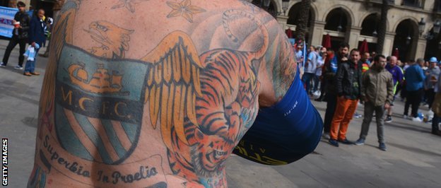
Declan McHugh: City are getting ANOTHER badge. Again? What about all those people with tattoos?

This would take some changing…
Source: BBC Sport


